
COOL NUMBER
This is the campaign launched by a local telco company to promote new personalize cool number for new users.
COOL NUMBER
This is the campaign launched by a local telco company to promote new personalize cool number for new users.

CHERRY CREDITS CONSUMERS
Make your life easier, faster and more efficient

CHERRY CREDITS CONSUMERS
Make your life easier, faster and more efficient
CHERRY CREDITS CONSUMERS
Make your life easier, faster and more efficient

CHERRY EXCHANGE APP
The accessible, secure and convenient payments for gamers to purchase the game's credits.

CASE STUDY: SMARTLINK APP
Travel easier, faster and more efficient done in 2017

CHERRY CREDITS CONSUMERS WEBSITE
Cherry Credits is a company that offers Unified Global Virtual Credits and publishes online games in Southeast Asia. They have two online portals, the main website for public use, and Cherry Exchange, a personal electronic wallet for top-ups, purchases, and redemptions of digital content and virtual credits.
Cherry Credits consisted of two online portals:
-
Main website: The public-facing website (cherrycredits.com)
-
Cherry Exchange: The personal electronic wallet which allows for top-up, purchase and redemption of digital content and virtual credits.
THE CHALLENGE
The main goals of the project are to create an integrated design system and language that caters to all user types, merge the two online portals into a one-stop solution, improve UX journey and UI, increase traffic for users and merchants, ensure promotions and news reach users, attract users to check the site regularly, find alternative ways for merchants to push sales, and make everything responsive.
THE PROBLEM
Here's a list of the problems identified in the case study:
-
The website does not look secure.
-
There are broken links on the website.
-
The website has an outdated look that cannot attract millennials who are the main customers.
-
The website has a non-unified look.
-
There are too many font sizes on the website.
-
The small font size makes the website illegible.
-
There are too many 'one-off' components on the website.
-
The website is not compatible with modern browsers.
-
The website is not mobile-responsive.
-
The website is slow to load because assets were not optimised.
-
The website is confusing, and new users are unsure how to do a transaction.
-
The website is not user-friendly, and users are unable to seamlessly find relevant game information.
-
Top-up methods were not catered to individual users (not personalised).
-
Users were not able to suggest games and top-up methods.
HIGH LEVEL TIMELINE
The team was given 8 months to redesign, code and launch the website.
MAKE OF THE TEAM
The project involved a copywriter, a frontend developer, and a UX/UI designer.
KEY METRICS
The main key metric of the project was to convert public users into paying customers, with a goal of improving this by at least 5%.
To achieve this, there were two secondary key metrics:
to shorten the number of clicks to complete a transaction, and to increase the overall satisfaction users get from the website.
MY ROLE
As a UX/UI Designer at Cherry Credits, I was responsible for revamping the company's websites to improve sales and user retention.
My main tasks included conducting research to understand stakeholder and user needs, analyzing data and insights from competitive research, qualitative interviews, and usability studies, and ideating solutions based on customer insights.
I worked closely with the copywriter and frontend developer to create a complete website overhaul, focusing on visual design and prototyping for ease of inter-department communication and execution. I also conducted internal usability testing to ensure a user-friendly interface and experience.
Through my efforts, I was able to improve the website's conversion rate from public users to paying customers by at least 5%, shorten the number of clicks to complete a transaction, and increase overall user satisfaction.

UNDERSTANDING THE USER
Identifying existing base plus potential users
Cherry Credits' users are predominantly male gamers aged between 21 and 35, with the most significant user base in the 21 to 25 age bracket, followed by the 26 to 30 bracket, and a tertiary group between 13 to 20 years old. The majority of users come from developing countries, where credit card access is limited, and alternative methods for purchasing credits are preferred. The top countries with the largest user base are the Philippines, Malaysia, Vietnam, Indonesia, Singapore, and Brazil
User Interview
To understand our users better, we conducted interviews with 4 people (2 existing and 2 potential customers) and sent a survey to 4 more. We wanted to know what our users are trying to achieve and what their problems are.
The interviews lasted less than 30-45 minutes and covered topics such as their favourite games, how often they buy game credits, what motivates them to make purchases, and what incentives would encourage them to spend more.
After analyzing the data from these interviews and getting insights from the Marketing department, we identified our target users as Generation Y, millennials, and teenagers.
Based on this information, we created 3 personas that represented our target users' needs and user journeys.
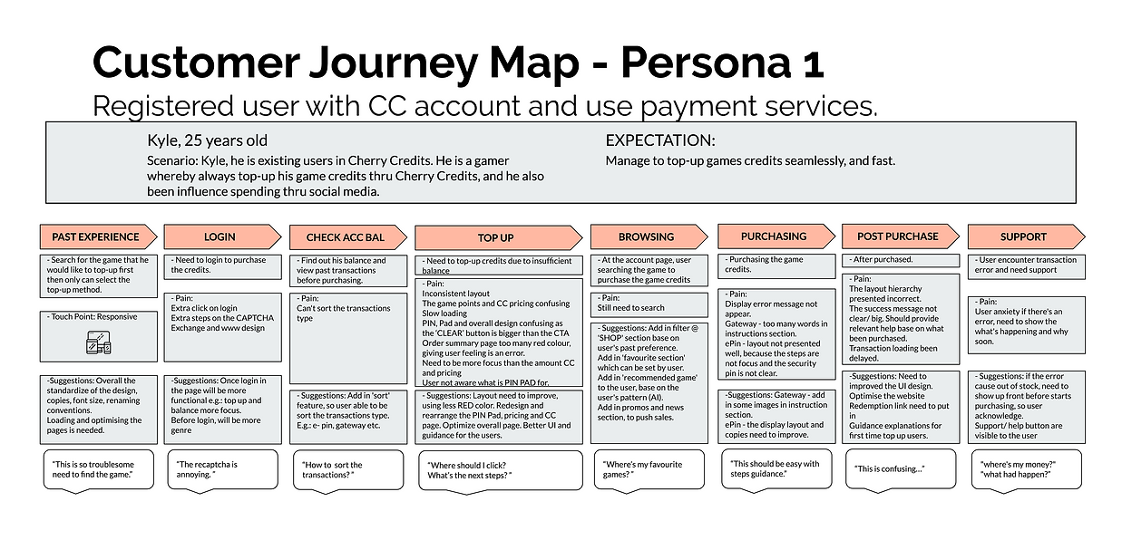
Persona 1
Registered user with Cherry Credits Account and use payment services.

Persona 2
Public user, non-registered, ready to pay, play games and wants to join events.

THE INSIGHTS
User Journey
The feedback gathered helped us in making an affinity diagram with everything we collected.

The Insights
The team identified seven main problems that users were facing and came up with statements to address them.
-
New users need more information to trust Cherry Credits.
-
Existing users want a simple and easy way to log in and complete transactions.
-
All users want to easily browse games, payment methods, and promotions.
-
Potential paying users need a way to contact Cherry Credits to make transactions.
-
All paying users want to keep track of their transaction information.
-
Business users want to know how Cherry Credits can benefit their business.
-
All users want access to a FAQ section for reassurance.
To address these problems, the team created a site map that accommodates all user journeys.
Onboarding
The old Cherry Credits homepage was confusing and lacked important information about the business. Users were overwhelmed with banners and game images, which caused confusion and made it difficult to understand what the website was about and what users could do on it.
Persona 3
Public user, non-registered, promo-chaser, which still deciding which payment to use, NO loyalty, has many other payment accounts.
BREAKING DOWN THE PROCESS
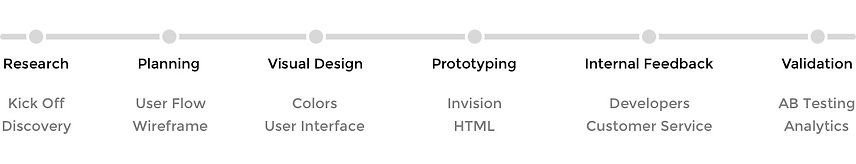
Design Process
The design process began with conversations and interviews with the stakeholders to ensure everyone was on the same page with the company's vision and goals.
Then, we conducted research on user behaviour and analyzed our competitors. Based on those insights, we planned and created the user journey, user flow, and wireframe with the team.
Next, we implemented design principles such as contrast hierarchy, feedback, brand attributes, voice and tone, and user interactions into the production phase.
Stakeholder Interviews
CEO, COO, VP

The stakeholders, in this case, were our own Head of Departments. Though they have a common goal to make the new website better, each of them has a specific interest in regards to their role.
CEO: Interested in sales and profits
COO: Interested in user experience
VP Business Development: Interested in merchant/partner acquisition and retention
Competitors
We did a general analysis of competitors in a similar industry to compare and see if we can improve further.
Spot repeating patterns
-
Big Hero banner set in an automatic rotating carousel
-
Prominent Search
-
Links to best-selling products/services highlighted
-
Signup + Login + Language/region located at the top right of screens
-
Payment Channels/Partners are featured near the bottom before the footer
COMPETITOR ANALYSIS COMPARISON
Login
STEAM
top right
MOL
top right
OffGamers
- top right
- social login
Old Cherry Credits
- top right
- social login
Language / Country
STEAM
top right
MOL
top right
OffGamers
- top right
- countries
- currency selection
Old Cherry Credits
top right
Main Banner
STEAM
- middle top after navigation buttons
- widescreen
- single
MOL
- middle top after navigation buttons
- widescreen
- carousel
OffGamers
- middle top after navigation buttons
- widescreen
- carousel
Old Cherry Credits
- middle top – small
- carousel
Secondary Banner
STEAM
- middle after still banner
- promoting discount/offers
- 10x carousel banners
MOL
- middle after main carousel banner
- promoting promo/free stuff & social media
- 4 x still banners
OffGamers
- middle after main carousel banner
- promoting news/ discounts + extra promotions button
- still but a user can rotate the banners (10 banners)
Old Cherry Credits
NIL
Navigation
STEAM
top and left
MOL
top and bottom
OffGamers
top and bottom
Old Cherry Credits
Not present
Support
STEAM
top
MOL
top and bottom
OffGamers
top side left, top right '?‘ and bottom
Old Cherry Credits
middle right under connect and exchange, bottom
News /
Trending /
What's Hot
STEAM
- left side text navigation
- middle almost bottom
- secondary banners
MOL
- main carousel banners
- after secondary banners
OffGamers
after main carousel banners
Old Cherry Credits
middle bottom
Promotions
STEAM
- main still banner
- after secondary carousel banners
MOL
- main carousel banner
- secondary still banner
- latest news
OffGamers
- main carousel banner
- secondary banner with CTA
Old Cherry Credits
- main carousel banner
- latest news
Social Media
STEAM
middle bottom
MOL
right bottom
- Youtube
OffGamers
right bottom
- Google+
Old Cherry Credits
left bottom
- Youtube
HEURISTIC EVALUATION


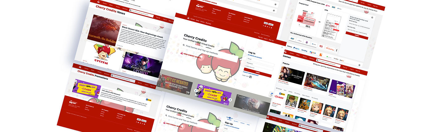
Cherry Credits - previous main website
This is the old design of the Cherry Credits main website.
Cherry Credits - previous exchange website
This is the old design of the Cherry Credits exchange website whereby the user needs to login to purchase the CC.
Cherry Credits had an additional portal called Cherry Exchange, which was only accessible after logging in. This portal was used for all account-related activities, including updating passwords, topping up balances, and redeeming ePINs and game credits. However, new users who landed on this page were confused because they were unable to preview the services without first signing up. As a result, the bounce rate for new users was high on this page.
Merging of Both Portals
The team needed to combine two portals, Cherry Credits and Cherry Exchange, into a new homepage that catered to both new and returning users. They had to ensure that the new homepage conveyed what Cherry Credits was about and provided easy access to account-related activities. However, the stakeholders had differing opinions on how the new homepage should look, which led to multiple iterations.
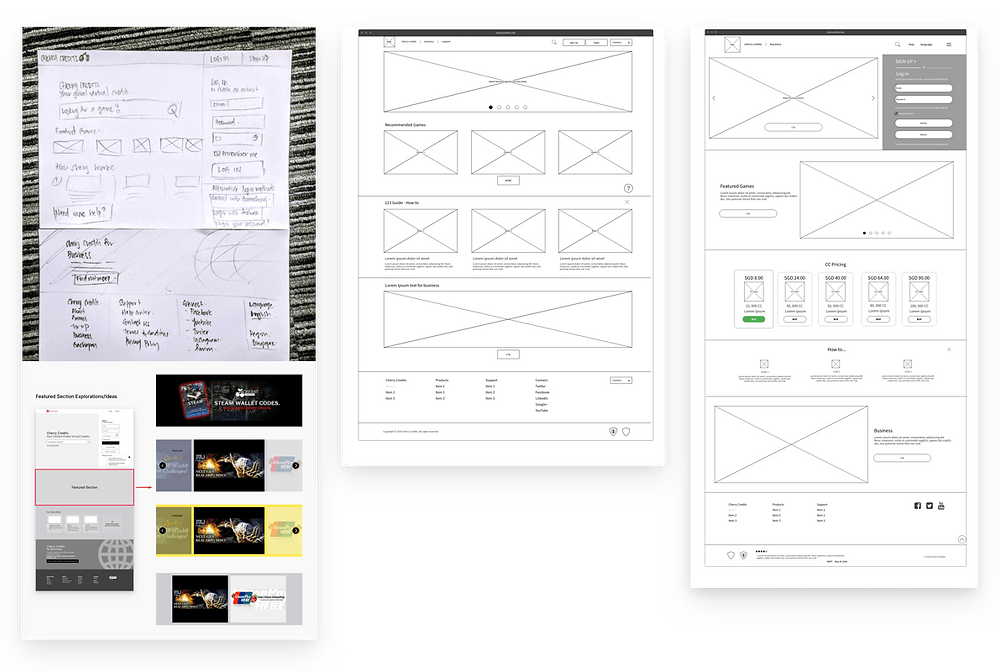
Wireframes
Initial wireframes for the homepage

We divided the new home page into several sections and designed it so that every section could satisfy the needs of one of our target groups:
-
For new visitors (the green flow), we provided a tagline to summarise what is Cherry Credits and provided information of how Cherry Credits works and some custom featured game banners to entice them to the service.
-
For returning visitors (the red flow), who will most likely skip the home page or use it as a waypoint, the navigation pointed a way out to browsing games and top-up methods. They can also just search for their favourite games or top-up methods in the prominent search bar. This search bar can also be accessed on every page of the new website in the top header.
-
We left a smaller part at the end of the page (the blue flow) for potential business partners, listing some of our prominent content and distribution partners, a tagline that summarises Cherry Credits' value for businesses and a CTA that goes into a brand new corporate page.
The goal of the on-boarding process was to capture the customer’s attention and seamlessly lead them to their eventual respective goals.
Browsing Designs
Cherry Credits provide two primary services for users:
-
Buy specific game credits
-
Top-Up credits in their Cherry Account
Browsing games and top-up methods are where new users spend most of their time on the website. For returning users, they will usually search for specific games and top-up methods or bookmark the specific page in their own browsers.
Browsing Games
Since we kept the homepage clean, we can offer a more streamlined view of all the games available in Cherry Credits.
Aligning with Marketing goals, the 3 most popular games will be featured prominently. The rest of the games catalogue is displayed in a grid and users can filter by the category type.
Browsing Top-Up Methods
The initial idea for displaying top-up methods was to follow the games listing to keep the site uniform. Stakeholders, however, felt that users might be confused about the different types of top-up methods. They wanted something different that can help users make that decision much easier.
We felt this was plausible since most returning users would skip this section altogether. They already know their preferred method and are more likely to use the search bar to get to it fast.
We came up with a much simpler screen that helps in deciding a top-up method easier. Instead of listing out all top-up methods, we present users with the top-up options first:
Prepaid cards and e-pins were the most used methods so users can instantly do their top-ups on this page.
-
A credit card section was included to promote credit cards usage, to address Marketing and Business Development teams' goals. This option was singled out and placed first on top.
-
A new section was created to let users suggest their favourite top-up method if it currently does not exist in Cherry Credits.
-
A ‘view all’ section that lets users browse all other top-up methods.
Idea interventions by the management
Sometimes clients might want to have a say in the project based on personal reasoning. We believe in listening to them and finding out more on the final objectives. Not everything clients say are nonsense.
THESE WERE SOME MAJOR LEARNINGS OR POINTS WE WANTED TO CALL OUT
Prototyping
We used Invision for rapid prototyping for a major part of the website. Invision is great for showing quick concepts and it creates a believable prototype for our Stakeholders and test users. Designers can easily put across their ideas without handling code directly. Specific interactive processes can also be shown to Developers to access technicality issues before moving forward.
For our case, the commenting system on individual screens helped us collaborate better. Even Stakeholders are able to comment and check-in daily to have a feel of the progress.
Tools and process
We used a mixture of Gulp and Codekit as our build process. This greatly speeds up our work. All our codes are hand-coded with HTML5, SCSS and jQuery.
Components and templates
Even though we officially started coding after the prototypes were agreed upon, we had already started building the skeleton layouts and major components via atomic CSS. We love using the atomic CSS methodologies because it optimises our CSS files and forces us to think about reusability. It is also a very fast way to test out a layout and prototype with code.
Prototyping in real code makes it easy to demonstrate the more complex interactions needed and identify any problems with various browsers simultaneously.
Handover to Developers
Once the HTML files were ready, they were passed on to the Developers to build the functional back-end logic. Most of the time, the final integration needs to be touched up to align with the HTML prototypes.
Validation
All projects should not just be a one-time delivery. It is important to validate project success by reviewing it. Ideally, we will be considering usability tests, A/B testings, and other in-depth surveys with the user to further optimise and enhance the website.
More data will be needed to see if the goals and key metrics have been met.

Update
The response has been great so far. Traffic to the website has increased by roughly 40%. This could be just superficial numbers due to the fact that the site has just been relaunched and users are just checking out what's new. A longer period of data set will be needed to determine where and what we can improve on.
LESSONS LEARNED
This was a very long project in the making and here are some of the takeaways that we learnt.
-
Data is king. It always helps to have more data to refer to and validate our findings.
-
Involving developers early on in the project helps to prevent technology barriers. They are also able to better advise the feasibility of complex interactions.
-
Don't assume the obvious. We may find it natural for a particular flow or interaction since we are the project owners. But it may not be obvious for real users. Most of the time, writing good microcontent to guide the users is always beneficial.
-
Document your design.
-
Don't focus on unique visual designs.