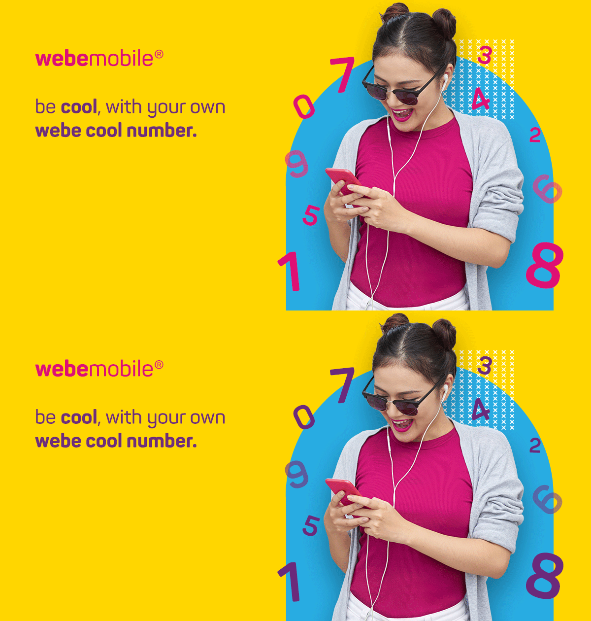
COOL NUMBER
This is the campaign launched by a local telco company to promote new personalize cool number for new users.

COOL NUMBER
This is the campaign launched by a local telco company to promote new personalize cool number for new users.

CHERRY CREDITS CONSUMERS
Make your life easier, faster and more efficient

CHERRY CREDITS CONSUMERS
Make your life easier, faster and more efficient

CHERRY CREDITS CONSUMERS
Make your life easier, faster and more efficient

CHERRY EXCHANGE APP
The accessible, secure and convenient payments for gamers to purchase the game's credits.

CASE STUDY: SMARTLINK APP
Travel easier, faster and more efficient done in 2017

COOL NUMBER
A local telco company has launched a new campaign to promote personalized cool numbers for new users. This campaign aims to provide new customers with the opportunity to choose their own unique phone number, which is memorable and reflective of their personality. The telco company hopes to attract new customers and offer a personalized touch to their service. Through this campaign, the telco company aims to differentiate itself from competitors and establish a strong brand image in the market.
THE VISUAL
Webe, a local telco in Malaysia that targets younger consumers, is launching a new product called 'Cool Number'.
This campaign is aimed at new users who can now personalize their own phone numbers for free. The branding features playful designs and the use of bright colours to attract and engage with the younger demographic. Through this campaign, Webe hopes to differentiate itself in the market and attract new customers who value a personalized touch in their telecommunications services.
HIGH LEVEL TIMELINE
I was given 1-2 days to create the visual and the website layout
MAKE OF THE TEAM
UX UI Designer
KEY GOAL
The key goal for the design and development of the 'Cool Number' campaign website is to ensure it is mobile responsive and loads quickly, while also maintaining the Webe branding. This will help to attract new customers and reinforce the brand's image.
MY ROLE
I'm the Visual Designer for this campaign.
To promote the "Cool Number" campaign, a flow was created to guide users through the process of getting a personalized number for free.
The flow starts with information about the campaign, followed by step-by-step instructions on how to obtain the personalized number and a call-to-action. The flow ends with FAQs and terms and conditions, and the Webe branding website sign-off footer. To make the campaign more appealing and fast-loading, the numbers in the first fold were animated by changing colours across all advertising materials, banners, EDMs, websites, and other marketing channels.


THESE WERE SOME MAJOR LEARNINGS OR POINTS I WANTED TO CALL OUT
Emotional
Using yellow as the primary color for the campaign is a strategic choice to evoke specific emotions in the audience, such as joy, freshness, energy, optimism, and youthfulness.
When designing a project, it's important to consider the emotional response you want to elicit from the audience and the story you want to tell through your design choices. In this case, the use of bright and playful colors helps to communicate the fun and exciting nature of the campaign and appeal to the younger target audience.
Your Audience
When choosing colors for your brand, think about the emotions you want to convey to your audience. Different colors can evoke different emotions, so it's important to understand what your target demographic responds to. Consider doing some research to find out which colors are most effective for your audience.
Balance
It's important to find a balance when using colours in your design. Avoid using too many colours as this can lead to eye fatigue and overwhelm your customers. Instead, consider introducing new colours in small quantities to reduce the risk. Also, make sure that the colours you choose work well together and convey the intended emotions and message of your brand.
LESSONS LEARNED
In addition to the importance of colour in web design, this project also highlights the need for balance and simplicity in design.
By using a limited colour palette and simplifying the design elements, the website is able to load faster and maintain the Webe branding while still being visually appealing. It's important to strike a balance between creativity and practicality to ensure that the website is both functional and aesthetically pleasing. Finally, it's crucial to consider the emotions and story that the website is trying to convey, and choose colours and design elements that align with those goals and target demographics.